Apps & Websites People Love to Use
Great products aren't an accident. Here's how research-driven UX, thoughtful UI, and a clear design process turn ideas into apps and websites people actually enjoy using, and what to expect when you work with us.

Think about the last app you deleted after a day. Maybe it buried the one button you needed. Maybe sign-up asked for too much, or every screen felt like a puzzle. You didn't file a bug report. You just left.
That's the quiet truth about digital products: people rarely complain about bad UX. They just stop using it.
The flip side is just as true. When an app feels effortless, people come back, recommend it, and forgive the occasional rough edge. That feeling isn't luck. It's the result of deliberate UX (user experience) and UI (user interface) design.
In this post we'll break down what makes a product lovable, the process we use to get there, and how you can apply the same thinking to your own app or website.
UX vs. UI: What's the Difference?
The two terms get used interchangeably, but they solve different problems.
| UX Design | UI Design | |
|---|---|---|
| Focus | How it works | How it looks and feels |
| Core question | "Can people get what they came for, easily?" | "Is it clear, consistent, and on-brand?" |
| Typical outputs | Research, user flows, wireframes, information architecture | Visual design, typography, color, components, style guide |
| Success looks like | Fewer drop-offs, faster tasks, less confusion | Instant recognition, trust, delight |
A simple way to remember it: UX is the route on the map. UI is the road signs, the paint, and the scenery. You need both to get people where they're going, and to make them want to take the trip again.
5 Traits of Products People Love
1. They're obvious
The best interfaces don't need a tutorial. Primary actions stand out, labels say exactly what they do, and navigation follows patterns people already know. If users have to think about how to use your product, they're spending energy that should go toward the task itself.
2. They're fast, or at least feel fast
Speed is a design decision as much as an engineering one. Skeleton loaders, optimistic updates, and smart defaults make an experience feel responsive even while data is still on its way.
3. They respect people's time
- Ask only for the information you actually need.
- Let people browse before forcing sign-up.
- Remember preferences so users never repeat themselves.
- Keep the critical path (search → choose → pay, for example) as short as possible.
4. They're consistent
Same button styles, same spacing, same tone of voice on every screen. Consistency builds trust: when one part of the product behaves predictably, users assume the rest will too.
5. They're accessible
Good contrast, readable type sizes, tappable targets, and screen-reader-friendly structure aren't extras. They make the product better for everyone, including someone using their phone one-handed in bright sunlight.
Our Process: From Idea to Dev-Ready Design
Great design comes from a repeatable process, not a burst of inspiration. Here's how we take a product from rough idea to something developers can build with confidence.
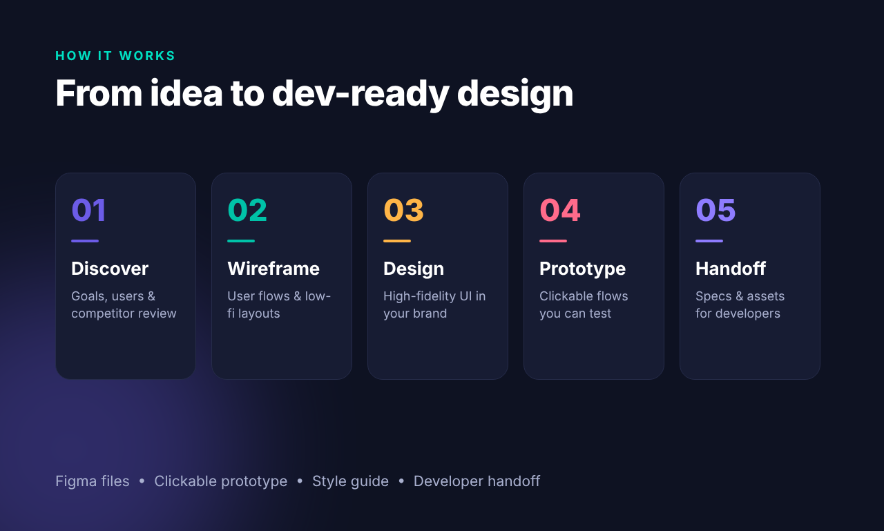
01 — Discover
Goals, users & competitor review
Before drawing a single screen, we get clear on why the product exists and who it's for. That means:
- Defining business goals and success metrics
- Understanding your target users: their needs, habits, and frustrations
- Reviewing competitors to spot what works, what doesn't, and where the gaps are
02 — Wireframe
User flows & low-fi layouts
Next, we map out how people will move through the product. Low-fidelity wireframes let us test structure and flow quickly, without getting distracted by colors and fonts. Changing a wireframe takes minutes; changing a built feature takes days.
03 — Design
High-fidelity UI in your brand
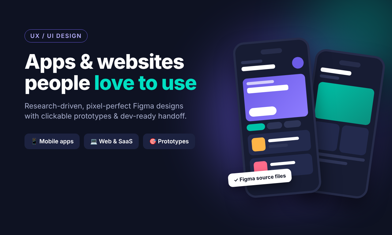
With the structure validated, we bring it to life: pixel-perfect screens in Figma, built on a reusable component system that reflects your brand's colors, typography, and personality.
04 — Prototype
Clickable flows you can test
We link the screens into a clickable prototype that looks and behaves like the real thing. You can tap through it on your phone, share it with stakeholders, and put it in front of real users, all before a line of production code is written.
05 — Handoff
Specs & assets for developers
Finally, everything is packaged for a smooth build: annotated specs, exportable assets, spacing and color tokens, and component documentation. Developers get what they need without guesswork, and the shipped product matches the design.
What You Get
Every project ends with a complete, practical package:
- ✅ Figma source files, organized, named, and yours to keep
- ✅ Clickable prototype for testing and stakeholder demos
- ✅ Style guide covering colors, typography, components, and usage rules
- ✅ Developer handoff with specs and assets ready for implementation
Who It's For
📱 Mobile apps iOS and Android experiences designed for thumbs, small screens, and on-the-go moments.
💻 Web & SaaS Dashboards, marketing sites, and web apps that make complex workflows feel simple.
🎯 Prototypes Need to pitch investors, validate an idea, or test with users first? A polished prototype gets you there without the cost of a full build.
Why Design Before You Build?
It's tempting to jump straight into code. But skipping design usually costs more in the long run:
- Cheaper changes. Fixing a flow in Figma is far less expensive than rewriting shipped features.
- Clearer scope. Developers estimate more accurately when they can see exactly what's being built.
- Earlier feedback. Prototypes let real users react before you've committed budget.
- Better alignment. Founders, designers, and engineers all point at the same screens instead of interpreting a written spec differently.
Design isn't the step that slows you down. It's the step that keeps you from building the wrong thing quickly.
A Quick UX Checklist for Your Product
Use this to sanity-check any app or website you're working on:
- Can a first-time user complete the main task without help?
- Is the primary action on each screen visually obvious?
- Are forms as short as they can be?
- Do error messages explain how to fix the problem?
- Is text readable, with enough color contrast?
- Are buttons and links large enough to tap comfortably?
- Does the design look and behave the same across screens?
- Have real users (not just your team) tried it?
If you answered "no" or "not sure" to more than a couple, there's real room to improve, and real users waiting for it.
Let's Build Something People Love
Whether you're starting from a napkin sketch or redesigning a product that's already live, we can help you turn it into an experience people actually want to use.
Research-driven. Pixel-perfect. Dev-ready.
👉 Get in touch with Azarr Technologies to talk about your next app or website.